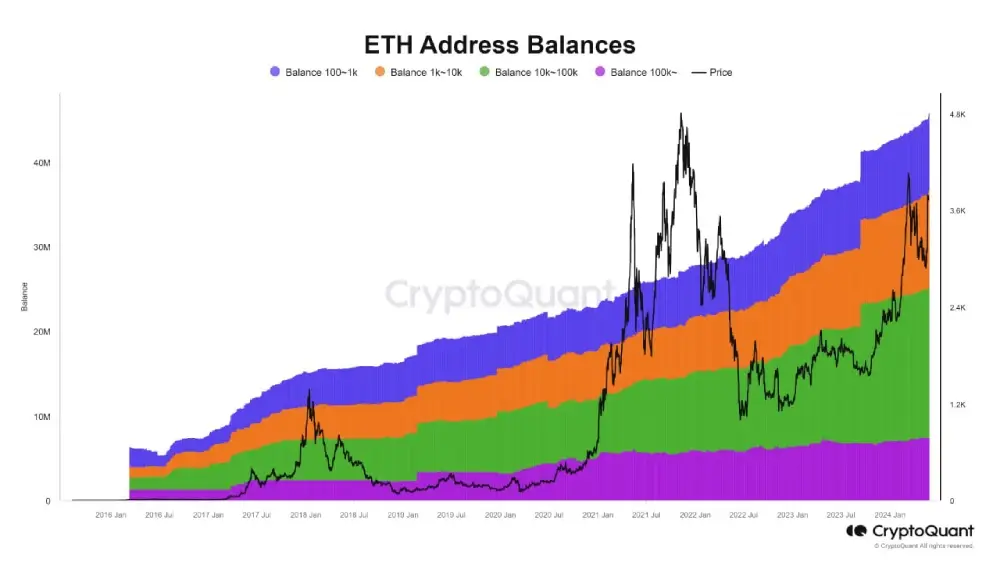
This graph shows a growing trend in the number of addresses in each balance range over time, indicating increasing demand and accumulation of ETH.
Of particular note is that the increase in the number of addresses with large balances indicates that institutional investors or “whales” are accumulating more ETH.
Black line: Represents the price of ETH.
Blue area: Represents addresses with balances between 100 and 1,000 ETH.
Orange area: Represents addresses with balances between 1,000 and 10,000 ETH.
Green area: Represents addresses with a balance between 10,000 and 100,000 ETH.
Purple area: Represents addresses with a balance of more than 100,000 ETH.
Our Social Networks :
X.com
Telegram
Facebook
Instagram
Our Partner in advertise :
Visit our New product where we discuss crypto world : 